 |
| Clean, clear, but lacks a bit of luxury. |
 |
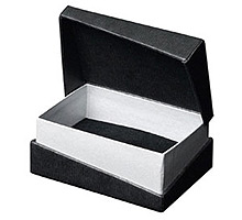
| Range of simple packaging. This could work well if a logo were foiled of embossed onto it. |
 |
| Clear packaging works well because you can see the contents and creates engagement with it. |
 |
| Existing Swarovski packaging is elegant with foiling and velvet inners. |
 |
| Simple boxes made from card don' quite do the brand justice. I think the packaging should be interesting or different in some way. |
 |
| Opaque bags could work well with the nail varnish design as you can see the product within. |
 |
| I love the simplistic design with the bold foiling against the black background. |
 |
| Cellophane wrapping to put the nail varnish in would add drama to them. The bow also looks great and links in with other research I have done into the bottle design. |
 |
| The nail varnish could sit on its own or could be packaged with a range of other nail varnishes or jewellery as a gift set. |


The cellophane packaging is exquisite! And the silver ribbon definitely adds more class to whatever product it has inside. :)
ReplyDelete~ Pearlie Mcilvaine