Showing posts with label Brief 4. Show all posts

Thursday, 1 December 2011

Bag For Life

Plastic bag still looks a big cheap even though it is around the same price to make a cotton/ material bag

Nice neutral colours and green of the Asda identity.

Nice message on the bag engages customers.

Playful type gives the bag personality


I like the simplicity of the message on this bag, it works well and still looks quite useable for everyday shopping use.


Showing the bag has already been recycled makes the customer feel like they are doing good just by buying the bag and not even having to re-use it to be dong good.


For the Asda bag for life I think it would be a good idea to carry on the identity of the Necessities brand through. For exmaple using statistics possibly '100% cotton'.

Tuesday, 15 November 2011

Value Range - Nutritional Information Comparison

Looking at the concept of exploiting value ranges for their nutritional contents.

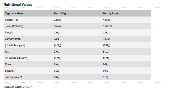
Thinking about value ranges you automatically think that they are going to be worse for you health wise. Here are some comparisons to see if this is true.

Tomato Soup -

Value

Heinz

The value can of soup has less calories, less carbs and less fat than the Heinz can.


Strawberry Jam -

Value

Hartleys

The value and named brand are very similar here, yet you have to pay three times the price for the branded jam.

Just because it is cheap doesn't mean it is worse for you than the more expensive and well known brands.

Here is a link to Charlotte's blog where she has posted a few more named brand and value comparisons :  LINK

Monday, 14 November 2011

Value Range - Chosen Packaging To Re-brand


Paper/Card:


Glass: 


Red wine doesn't already exist on the smart price range for Asda, however we feel it is a necessity and therefore will be linking the re-branding in with a red wine bottle.


Plastic:


The existing tomato sauce bottle is made of glass, however we will be using plastic for the bottle in our re-brand.


 Cellophane:


Tin can:


There isn't a can of cola for the smart price range already, but for the purposes of this brief we will be including one.


Value Range - Simplicity


Value ranges in supermarkets are have very simplistic designs. They also only use the cheapest of materials because the cheaper the product is to manufacture the cheaper it can be to the customer.

White card and cellophane are the key materials sued for value ranges and therefore this is what we will focus on using in this project to keep costs to minimum.

Below is a collection of branded ranges that show simple, minimalistic design and materials that would be fees-able to use for a new value range. They are however a lot more pleasing to the eye with no more extra cost.

I really like the use of white space on this range, it makes the product look clean and fresh.

Being able to see the contents of a product increases trust because you can see exactly what you are getting.

Regarding imagery using ink blots could work well to illustrate the contents of each product in an abstract and eyecatching way.

Simple, straight to the point, no unnecessary information.

Giving the packaging a purpose and appealing to the customer with this is essential for it to be accepted by the audience. Because it is so cheap to produce and sell you automatically think that it is bad for the environment, giving the customer an incentive to buy the product could increase sales. This could work as part of the main concept, giving people a reason to buy value over other products.


Bold type and underlining makes the type standout in a crowd of other products.

Colour on a black background stands out well. The black and the colour would stand out because customers are used to seeing value ranges in bland white and ugly colours.

Simple, readable text that it beautiful to look at.


Picking a single colour needs to be well thought out. The colours chosen need to reflect the brand chosen to represent.

This packaging is very type driven and uses eco friendly materials to make it look earthy.

This range has to be my favouite design from this post. It is so simple and easy to produce, yet really effective and beautiful. The text tells you form afar what the product is and the lines give the product structure. The less important information is smaller on the packaging and almost invisible against the large main type.

This is a perfect example of how branding can be stripped down and made minimal with maximum effect. With a brand as well-known as m&m's you don't need to know loads of information about the brand because you are already familiar with it. Supermarket brands are already well known and trusts so only the most minimal amount of information and imagery needs to be used because the customer is already 'in the know'.

White and colourful could work well but it looks slightly childish here.

I absolutely love the simplicity of this range. It all fits together really well, yet it only has the smallest amount of information and print on the range.

Thursday, 10 November 2011

Value Range - Existing Designs


This has to be a collection of some of the ugliest design for supermarkets I've seen (ignoring the Waitrose collection). Below is a selection of 'value' ranges for the most popular supermarkets in the UK. They all use very simple design and the cheapest of materials. The products all relate very well to each of their brands, however they don't even attempt to do them justice. The colours used in each of the value ranges are the same as their supermarkets logo. Personally I think they are not very pleasant to look at, and not something that you would necessarily pick up because of this. Currently I am doing my dissertation on the influences of packaging on consumer behavior and how people cn buy the product because of the packaging. I have to say I wouldn't buy any of the product based on their packaging, in fact I would probably avoid them.


The two images below from Waitrose show a lot more design consideration. They are more pleasant to look at and yet they still are part of their value range. Waitrose has also named their version of value range as 'essential'. I think this is a lot more appealing to the customer because it connotes the everyday object and the trustworthy. The word 'value' connotes that perhaps you are not getting the best quality of product because it is so cheap. Whilst 'value' focuses on price, 'essential' focus more on the customer and their personal needs.