Monday, 10 October 2011

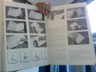
Lookbook Binding

Using embossing inside the book would give it an added finish.

Materials and knitted pockets could keep the book clean. The lookbook could be placed on top of material to show its high quality.

Threads on and in the pages will enhance that it is about fashion.
For the lookbook that is to be taken away by the customer a bowl like this could work well as it can be filled up throughout the day for people to take away. The contents could include a voucher and info about nights at Harvey Nichols.

Beautiful, simple stitching with thread ends left on for added effect.

New and intriguing textures.

Adding type to the sides of the lookbook could add to the design.


Using wood for the cover could work well as a standard cover with either lazer print or stained design and then the other pages could be added/fixed inside somehow and changed each month when he stock changes.

I think the pages should be individual and can be added one by one to the lookbook so they can be changes each month to make room for updated info. Some sort of less industrial looking filo fax clasp could be used, but there needs to be some sort of mechanism so that people don't just un clip the clasp and take out a page.

ISTD Brief 2012


Lookbook Cover

Simple but not very eye catching and doesn't really tell you what is inside the book.

Dull and not fit for purpose. Not high enough quality for a Harvey Nichols.


Very fun and playful, not suit able for my project though. The colours and movement look beautiful.

Lovely use of text over image.

Type looks good over the image however it isn't very easy to read.

This is very plain and simple, it would definitely fall into the background in Harvey Nichols.

Sunny, inspiring, interesting use of multiple typefaces.

Beautiful, simplistic, mysterious, intriguing.

Simple, eco looking, straight to the point.

I love the use of textures. For the look book I could actually use wood for the cover and stain the lettering into it.
I really like the idea of having a line or collection of items in a long line. Maybe not relating to the front cover, this could work well inside the magazine to show the collection of products featuring.

Soft, pastel colours with bold type works well.

Bright colours would work well for the summer monthly issues of the look book.

The colour creates the effect of texture and would work well for a fashion brand such as Harvey Nichols


I love the type of the title and how it blends in with the background image. It is a very beautiful natural image.

The black glossy finish makes the book look very high quality. The contrast between the white and black.

Lookbook contents page

The colouring is quite harsh and the layout, although it is easy to read, it is very uninspiring and eye catching.

With a contents page the most important thing I think is that you can quickly and easily find where you want to be. Here the numbers are very large whilst the text is tiny. Maybe a heppy medium of the point size would help for a clearer layout.

This contents page seems to dissect the book into chapters and not individual pages. It would be quit helpful to have chapters as well as paged numbers, but the pages definitely need to be individually numbered.

Pictures could be a very good way for people to visually see what is on each page.

I really like the simplicity of this contents page.

Addign imagery to the contents page give it depth and more interesting to look at. Also the use of fonts is very important to both look interesting and be easy to read.

Colour coding sections of the magazine would make it even simpler and quicker to find where you need to be.

This contents page looks slightly cluttered, however I do like the use of both type and image. Maybe if the page was more neatly structured.

This layout is lovely and structured. It is easy to read and with images to sum up each section it helps you eye to flow to the right areas on the page.

Having the majority of the contents page being an image I find slightly odd as this is a place for information not creation.

I love the eye catching use of type. Contents pages can often be pages that people just bypass because they can be boring, however this contents page does a good job of catching your eye with the bold typography and then the sleek/simple page information helps to make the whole thing less daunting to read.


Contents page evaluation: big type, images to interest, neat, clean and eye catching design.