Thursday, 24 November 2011

D&AD - Existing Entrance Design


D&AD - Rose Bowl Lecture Theatre


The design of the rose bowl is very architecturally sound. It has a bold structure with a focal tower made up of triangle glass sheets. I will incorporate this design into the event material to make it more personal to the building it is being held in.

Signage and banners can be put up inside to help people be directed the right way.

D&AD - GBH Identity

When looking at GBH on google, they are a lot less prominent. Their is a fair bit of their work here, but they lack much of a sence of identity. Saying that they are a design company they don't have themselves defined in an identity for the public. Their website is laid out nicely, but there is only one page and nothing to click on.

Because D&AD are running the event and GBH don't have as much of an online presence I will be focusing on D&AD for the promotional material for the event. Also, D&AD are much more well known and respected, and therefore people are more likely to come if they know it is D&AD rather than GBH.


Their work shows a mix of different styles. Mostly working with bold colours and with a broad and reputable client list.


D&AD - Events


Bold yellow and black dominate the brand making it very noticeable and recognisable. The brand uses minimal design for maximum impact. No frills approach corporate identity.

D&AD


As this brief if only going to be 1-2 days everything I research will have to be quick, snappy and precise to what I need to know. I already know a fair amount of information about D&AD here is a snap shot of their online presence giving an insight into their branding and their ethics.

Black and yellow are obviously prominent colours and therefore I will carry this on for my design work to enhance the fact that it is a D&AD organised event.


What they do and their ethics


Typing D&AD into google brings up a swarm like result of yellow and black.


Their presence is branded heavily with yellow and black. They use minimal design and relations for maximum impact... Yellow, black and a pencil = D&AD.

Tuesday, 15 November 2011

Value Range - Nutritional Information Comparison

Looking at the concept of exploiting value ranges for their nutritional contents.

Thinking about value ranges you automatically think that they are going to be worse for you health wise. Here are some comparisons to see if this is true.
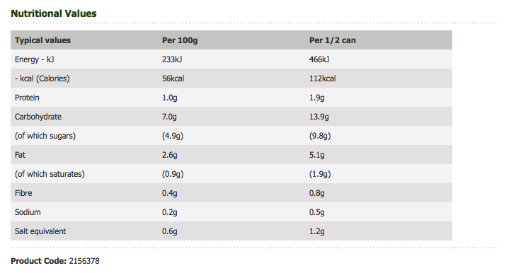
Tomato Soup -

Value

Heinz

The value can of soup has less calories, less carbs and less fat than the Heinz can.


Strawberry Jam -

Value

Hartleys

The value and named brand are very similar here, yet you have to pay three times the price for the branded jam.

Just because it is cheap doesn't mean it is worse for you than the more expensive and well known brands.

Here is a link to Charlotte's blog where she has posted a few more named brand and value comparisons :  LINK

Monday, 14 November 2011

Value Range - Chosen Packaging To Re-brand


Paper/Card:


Glass: 


Red wine doesn't already exist on the smart price range for Asda, however we feel it is a necessity and therefore will be linking the re-branding in with a red wine bottle.


Plastic:


The existing tomato sauce bottle is made of glass, however we will be using plastic for the bottle in our re-brand.


 Cellophane:


Tin can:


There isn't a can of cola for the smart price range already, but for the purposes of this brief we will be including one.