Monday, 17 October 2011

Lookbook Timelines

Simple with dates and images. Black white and yellow.

Interesting. Circular, colour coded, visually intriguing.

Pictures tell the story of the time lines not words.


I think the whole layout works really well but would need a lot of tweaking for the lookbook.

Lookbook Map Designs

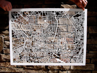
Beautiful hand cut designs are amazing, however this style of map would work best with detail and the store needs a simple easy to read map.


Maps using images to reflect what they are showing (fish and whales in the ocean).

Very simple and easy to follow map for a supermarket store. This style of simple block colour could work well for my store map design however, I would make some alterations to the colour palette to make it look more up market.


Level exmaple.

Lovely colour palette.

Simple lines and tones of blue make up this guide map.


Showing the levels together could get confusing. I think using different pages fr different layers will help for the most clarity.

I really love the use of pinks here. The use of the same colour keeps the design looking minimal and easy to follow.

Illustrative - not relevant.


Beautifully clear and precise.

Wednesday, 12 October 2011

Look book - Colour Pallette


One of my favourite websites that helps be look at colour palettes is Kuler. I think I would like to go with fairly neutral colours for the overall feel of the look book. However, showing such a vast array of colours within certain brands will mean I have to be versatile with my palette. 


Brighter/darker colours can be brought in rotationally throughout different seasons. Pink and green pastels would work well for spring. Darker pastels like purples, browns and blues would work well for the colder months.


Monday, 10 October 2011

Look book - Window Displays

There are some amazing window displays on the high street. The days of just having clothing on a lifeless mannequin are over. It has become an area taken over by creative minds. I will be mocking up a proposal for a window display to promote the launch of the Lookbook. Here are few unique ideas for window displays:


They are all very unique and interesting to look at. They are a big part of getting customers initially into the shop so therefore need to stand out form the crowd.

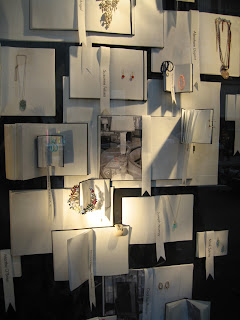
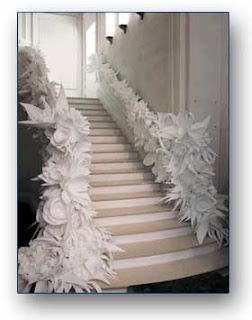
As I will be promoting the launch of the Leeds Harvey Nichols Lookbook, I think it would be an interesting idea to use paper as the main focal point of the window display. I'm not sure what I want the window display to show yet, but I really like paper art and really intricate things that can be modelled out of paper. Here are a few window displays and creations that people have made out of paper... amazing.


All the ideas are very fiddly and fragile, but overall they create an amazing item to look at and examine.

Carrying on the paper theme but into the fashion sector more; below are some dresses made out of mainly paper. They show the extreme beauty of paper in an art form. The clothing is very elaborate and I would say puts fabric to shame. This idea would be great to loosely relate to the launch of the new lookbook.


Just was this lovely pattern whilst looking for lazer cut paper. I think the pattern is beautiful, ad the form of it with the strong structure and the radiating light all fit together perfectly.