 |
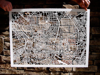
| Beautiful hand cut designs are amazing, however this style of map would work best with detail and the store needs a simple easy to read map. |
 |
| Maps using images to reflect what they are showing (fish and whales in the ocean). |
 |
| Level exmaple. |
 |
| Lovely colour palette. |
 |
| Simple lines and tones of blue make up this guide map. |
 |
| Showing the levels together could get confusing. I think using different pages fr different layers will help for the most clarity. |
 |
| I really love the use of pinks here. The use of the same colour keeps the design looking minimal and easy to follow. |
 |
| Illustrative - not relevant. |
 |
| Beautifully clear and precise. |


No comments:
Post a Comment