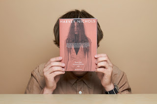
I have actually found an existing look book made for Harvey Nichols by Studio Baron. I can't tell weather it is just someones personal project or it has actually been used in store. This is one because there is no documentation or even mock ups of how it would sit in store and secondly I personally don't think its actually reflects the high end quality that Harvey Nichols stands for.
It seems to be made from very low quality stock, almost resembling newspaper-esque paper in some images. The layout is 'nice', but nothing to write home about.
I would say that Harvey Nichols as a store reflects the quality and standard work I would like to produce. I don't feel like this lookbook does the store justice and therefore perhaps you could say I am redesigning the lookbook.
The general idea of this brief is to get across my designs to the luxury market bu using print finishes, experimentation of stock, textures, interactivity and an inspiring book overall.
The caliber of people who enter and purchase from Harvey Nichols want to feel exclusive, special and they want the overall experience within the store.
So what would a busy business woman for instance want from their shopping experince?...
'The Perfect Shopping Experience':
1. Polite staff
2. Helpful staff
3. information about the products.
4. Quick and easy experience.
With this in mind my look book will aim to adhere to these standards. Obviously polite staff is not going to be helped by a lookbook, however the lookbook could definitely be helpful and ensure a quick and easy experience for the customer by informing them of where things are, what's on trend, hints and tips etc.


No comments:
Post a Comment