
Logo's are generally quit simplistic with a dark/night time theme.
 |
| This is a very famous night club in London. I was surprised to find that this was the logo for the club as I find it quite dull and ugly. However the style does reflect the simplicity needed for a nightclub logo. |
| I really like this logo although it is not obvious that it is a club logo. |
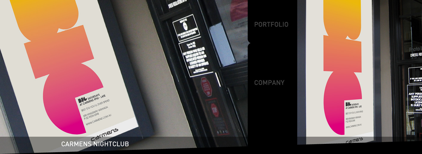 |
| I really like the gradient effect mixed with the chunkyness of this logo, it does scream 'night club' to me. |
| Simplistic text with a unique and still simplistic motif. |
| This logo is very elaborate. It has 3D effects and obviously has been photoshopped to the max. |
| The whole shiny glamorous and Photoshop finished logo is very now in the clubbing world. |
 |
| This is a very simple yet creative and clever type design. Something subtle like this could work well for the mission re-branding. |
| Gold shiny effect with image reflecting the style of type. Egyptian high class finish. |
 |
| Obviously I don't know what this logo says but they layout is very interesting. It makes clever use of the lines and symmetry of the type hierarchy. |
| Light bright colours incorporated into volume bars. |
 |
| Oceana is another very well known brand with a not so good logo to show. The only logic i can see behind the use of silver pipe style font is to reflect the hand rails inside the club.... not sure this is the idea they had behind it. Either way it doesn't scream amazing night club to me. |
| This logo is very interesting. Both the type and image have been well designed. It is evident that they both haven't just been plonked on a page without due care and attention. The rounded and sharp edges of the type help to add style and personality to the logo. |
The interior of a club is very important to the customer. Looking at some sleek and elegant interior designs for clubs has helped me to think about different ways I could approach the logo.
 |
| Subdued lighting |
 |
| Spotlights |
 |
| Quirky furniture. |
 |
| Secluded areas |
 |
| Colours add drama and statements. |
 |
| Mirrors and reflection. |
Here is a vast amount of flyers and advertisements for a range of different clubs. They all fit in well together and definitely portray a certain style. I need to therefore still be in keeping with this style when designing the logo. Because generally the club night flyers are cluttered with information the logo need to sand out well in a crowd.


No comments:
Post a Comment